A high colour contrast ratio between a text and its background makes said text easier to read for colour blind and partially sighted users. Many users also use mobile devices (a smartphone or tablet) with small screens to surf the web, often in situations with bad lighting. This makes contrast important to everyone.
What does sufficient colour contrast mean?
Colour contrast is the difference in brightness between two colours. WCAG 2.2 recommends a minimum value of 4,5:1 for texts of an average size, and 3,0:1 for larger texts (larger than 18pt or 14pt bold).
This example shows the same paragraph using different contrast ratios.
Bad: the blue word AnySurfer has a contrast of 3,0:1 compared to the black background.
Good: the orange word AnySurfer has a contrast of 8,4:1 compared to the black background.
Testing methods
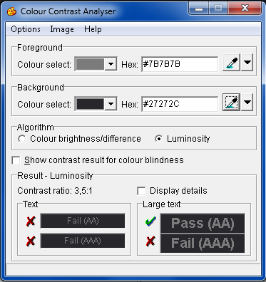
Colour contrasts can be objectively measured with the free Colour Contrast Analyser tool. Use the analyser's dropper to select a foreground and a background colour on your screen. The resulting contrast ratio must be at least 4,5:1 for texts of an average size. Larger texts (28pt or 14pt bold) need a contrast ratio of at least 3,0:1.
Other tools:
- Colour Contrast Analyser Tool
- Tanaguru Contrast-Finder generates accessible colour palettes
- We are colorblind examples and solutions
Contrast of non-textual content
User interface components such as links, form elements, and other graphical elements such as icons or graphs must be sufficiently visible and distinct. This means elements such as these must score a contrast ratio of at least 3:1 when compared to their adjacent colours.
Examples
- A text field must score a sufficiently high contrast ratio when compared to its border or background colour. The same goes for checkboxes and radio buttons.
- A non-decorative icon (e.g. a magnifying glass used as a search button) must score a sufficient contrast ratio when compared to its adjacent colours.
- Graphical elements that signify the state of an item, such as a checkmark in a checkbox, or an outlined link, must score a sufficient contrast ratio compared to their adjacent colours.
- Each slice of a pie chart must have a sufficient colour contrast compared to their adjacent colours: if each slice has been outlined, the contrast ratio must be measured between the pie chart and its border. If there's no border present, the contrast between the colours of adjacent slices must be measured, instead.
- Hover and active states do not require a contrast ratio of 3:1 when compared to their default states, but components do require sufficient contrast ratios with adjacent colours regardless of their state.
- When a change in colour is the only signifier of a component's state, a minimum contrast ratio of 3:1 must be present between these colours. For example, if the only difference between a checked checkbox and an empty checkbox is colour instead of a checkmark, these two coloured states must have a sufficient colour contrast ratio.
Colour blindness and contrast ratios
Colour blindness is a disability that effects an individual's perception of colour. Our eyes perceive colour based on a set of primary colours: red, green, and blue. If an individual experiences difficulties in perceiving one or more of these colours, this will result in a deviating colour view. As many as 1 in 12 men are colour blind, as opposed to 1 in 250 women. A complete inability to perceive colour is also possible (achromatopsy), but is very rare.
Due to the many types of colour disorders, we recommend avoiding the following color combinations:
- Red - green
- Black - red
- White - yellow
- Green - blue
The Colour Contrast Analyser allows users to simulate different types of colour blindness.
Examples
Links in texts
The following screenshot shows red links among black text.

When the same paragraph is shown in shades of grey, the red links become hard to distinguish from the black text.

Colourful backgrounds
A colourful background results in multiple colour contrasts. Make sure contrast ratio is sufficient for every colour combination. When this is impossible, replace the colourful background by an opaque one.
Colourful backgrounds can also cause issues for dyslexic users. Because of this, it is best to avoid them.

When seen in greyscale, almost none of our example's colours have a sufficient contrast ratio.

More information
- Atypical colour response: an article about colour blindness.
- Vischeck's Daltonize: an application that allows users to simulate multiple types of colour blindness.
- A list of tools regarding colour contrast.
Comments
Be the first to comment