A button that allows you to show or hide content is called a disclosure. Several techniques are available to make components like these accessible.
What is a disclosure?
A component qualifies as a disclosure when a single button is used to show and hide a segment of content. It differs from a dialog component, which opens an overlay containing its own close button.
Some examples:
-
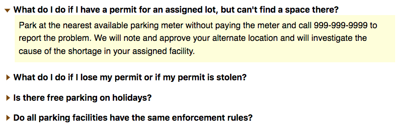
Frequently asked questions, where each question is a button that shows or hides the answer.
-
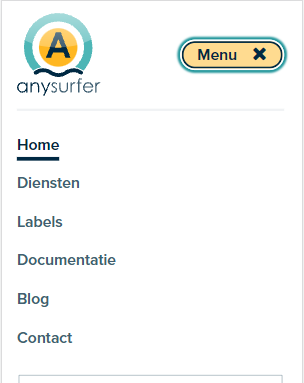
A hamburger menu in a mobile view port, often visualised by 3 horizontal bars:

-
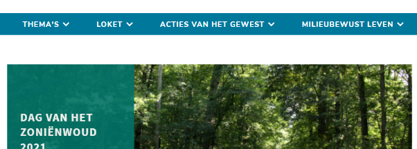
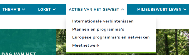
A dropdown menu:
How to make an accessible disclosure
- Place the expandable content immediately after the button in the source code
- Hide the content with
display:none - Inform assistive technology users about it status as an expand/collapse button
Source code order
When it comes to visual design, the content of a disclosure button is usually placed below or next to the button. As for the source code, the content is sometimes wrongfully placed before the button, or much lower. This causes problems for users who can't see their screen.
The source code's order must be correct when building a disclosure component: start off with the button that shows/hides the content, then add in the collapsible content.
Hiding with display:none
When a chunk of content is visually hidden, it must be hidden from everyone. Use display: none to hide the content. This way, it will be invisible to both screenreader users and keyboard users who cannot tab through concealed content.
Accessible status indicators
Visual indicators such as arrows are commonly used to mark a button as expandable/collapsable. This status indicator implies an action. Someone who has no visual overview of their screen does not know this button will expand/collapse when used. The content block's current state (visible or hidden) is also unclear. There are several ways to resolve this issue.
Change the button label
Change the button's label to indicate which action it will perform. For example, a hamburger icon leading to a collapsible menu will commonly have a label that announces the button will show the menu when activated:
<button class="navbar-toggler
data-toggle="collapse" data-target="#navbar-collapse" >
<span class="navbar-toggler-text">Toon menu</span>
<i class="fa fa-bars" aria-hidden="true"></i>
<i class="fa fa-times" aria-hidden="true"></i>
</button>
When the menu is visible, change the label of the button to "hide menu".
It's not always easy to choose a proper phrasing, especially when it comes to multilingual websites.
With details and summary
How does it work?
It's pretty easy.
<details>
<summary>How does it work?</summary>
<p>It's pretty easy.</p>
</details>
Based on this HTML, most browsers will fill in the accessibility tree correctly so screenreaders are able to announce the current role and the state of a component.
With aria-expanded
ARIA is also an option. Take a look at the authoring practice for a show-hide-component to see how it's done.
<button aria-expanded="false" aria-controls="faq3_desc" lang="en">
Is there free parking on holidays?</button>
- Contrary to the technique using
detailsandsummary, you must provide your own script to show/hide the content. - The
aria-expandedattribute relays the content block's state to the accessibility tree. Aria-expanded="true" means the content is visible. Aria-expanded="false" means the content is currently hidden. Always synchronise the value of this attribute with the visual state of the component. Screenreaders will announce this state when the button receives focus. - Add the
aria-expandedattribute to the button that toggles the visibility instead of the hidden/shown content's container. - Ensure that the
aria-expandedattribute has a correct value when the page is loaded. Don't just add it when the component's state changes. - Use a neutral button label when applying this technique, for example "menu" instead of "show menu" or "hide menu". The label remains neutral while aria-expanded indicates the state.
- The code example also contains an
aria-controlsattribute. This attribute informs assistive technologies of which content the button manages. Asaria-controlsis usually located immediately after the button in a disclosure's source code, this attribute is optional.
Comments
Be the first to comment